Import and export block content
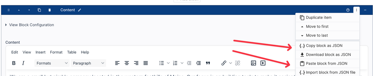
You can now export and import content for a single Block.
This enables you to more easily copy or move content to another page. Or, if you're working on a similar website, you can copy content to another site.
You can export the block content to a JSON file or to your clipboard. You'd then add the block to another page and either import the JSON file or paste the JSON from your clipboard.
If you're exporting and importing between two websites, the import will recognize if any files are involved and prompt you to migrate the files.
Multiple color and font palettes now supported
You can now create multiple font or color palettes. This update was mostly for colors, but the structure of font palettes is so similar we updated it too.
This is useful for organizing colors. You can also set up a color palette and use it only for color fields in other parts of the admin, like in Blocks.
We also added some additional features to color and font palettes, such as:
- Easily sort values alphabetically.
- Sort colors by color.
- Search across all colors and fonts in the palettes.
Search the theme editor
You can now search the theme editor!
This is a big feature, especially for websites that have a lot of styles and settings.
Searching will filter down the groups and fields that match the search. You can do simple text searches, or token-based searching for more control.
Below are the things that are searched:
| Setting names | The name of a setting, and the note underneath it. |
|---|---|
| Group and section names | Matching one of these shows everything inside it. |
| What a setting is set to | Search a color like #638C87, or a font name like Lato, to find everything using it. |
| Colors and fonts from a palette | Search the palette entry by name, or by the color or font it holds. |
| Settings inside another setting | Some settings hold several others — a text style holds a color, a font and a size. Searching any of those finds it. |
| Behind-the-scenes names | The names your developer uses, such as --MainNav-text, if you have been given one to look for. |
Token searching:
is:empty |
Fields with nothing set |
|---|---|
is:set |
Fields with a value |
is:palette |
Fields taking their color or font from a palette |
is:changed |
Fields edited since the theme was opened, saved or not |
type: |
One kind of setting — type:color, type:fontfamily. Start typing after the colon and it will show you the kinds this tab has. |
color: |
Search the color settings only. color:red is a shorter way of writing type:color red. |
font: |
Search the font settings only. font:Lato finds the settings using that font. |
palette: |
Search what a setting takes FROM a palette. palette:"Dark Brown" finds the settings using that palette color — and unlike searching for the words, not the ones merely named after it. |
To leave something out, put not: or a minus sign in front of it. not:palette and -is:palette both find the settings that are not using a palette, and -type:color leaves the color settings out.
Examples of everything you can search for
button |
Anything to do with buttons |
|---|---|
"Dark Brown" |
Words that belong together — quotes hold them as one phrase |
#638C87 |
Everything set to this color |
Lato |
Everything using this font |
--MainNav-text |
Everything a developer has tied to this name |
is:empty |
Settings with nothing filled in |
is:set |
Settings that have something filled in |
is:palette |
Settings taking a color or font from a palette |
is:changed |
Settings you have changed since opening the theme |
type:color |
Color settings |
type:font |
Font settings — the same as type:fontfamily |
type:typography |
Text style settings, which hold a color, a font and a size together |
type:border-radius |
Corner rounding settings — the punctuation does not matter |
color:red |
Color settings mentioning red |
color:"Dark Brown" |
Color settings mentioning that palette color |
font:Lato |
Font settings using that font |
palette:"Dark Brown" |
Everything actually using that palette color, whatever kind of setting it is |
not:palette |
Settings not taking anything from a palette |
-is:palette |
The same thing, written the other way |
-type:color |
Everything except the color settings |
is:empty type:color |
Color settings you have not filled in |
type:color not:palette |
Color settings holding a color of their own |
button is:empty |
Anything mentioning buttons that you have not filled in |
is:changed type:typography |
Text styles you have changed since opening the theme, saved or not |
is:pallete |
A misspelled filter still works |
pallet:brown |
So does a misspelled name in front of the colon |
Theme editor navigation improvements
We added some small but useful updates to the theme editor to improve navigation between tabs and groups.
- When going between tabs, the theme editor will now remember which group you had open and show that group when you go back to the tab.
- If you close a group, then the editor remembers your scroll position so that the group is visible again and it's highlighted.
New Color Gradient Styles
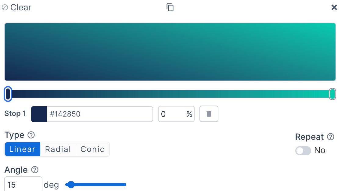
The color picker now supports gradients!
You can create gradients with any color picker, except palettes and text color (because gradients aren't supported for font colors).
There are a lot of configuration options.
- Create unlimited color stops.
- Set the gradient to repeat.
- Create linear, radial, or conic gradients.
- Adjust the angles.
- Start with preset gradient styles.
- Advanced options for blending to improve color transitions.
- Copy the CSS generated from the gradient.
Theme editor color palette improvements
We recently added a few additions and improvements to the Color Palette feature in the theme editor.
- There is now a menu button (the 3 vertical dots) next to each color palette item that lets you insert before, insert after, move to first, or move to last position. While you can still drag items up and down, this is a nice addition when you're adding to a large list. Font palettes also got this feature.
- Search the color palette.
On the color palette section you can now search by the color value or the color label. Helpful when you have a lot of colors in the palette.
You can also search the color palette when you're selecting a color in the color picker. When you choose the color palette option there is a search box at the top of the palette list that gets focus. - Add a color to the color palette from the color picker.
If you're editing a color elsewhere in the theme editor, you can now set that color to be part of the color palette right from the color picker. Go to the Palette section of the color picker and click on the "Add to palette" button at the bottom. You can set a descriptive name and set the display order (it defaults to last). - Edit an existing color palette color from the color picker.
When you're editing a color elsewhere in the theme editor, you can update an existing color palette value to be the value from the color picker. Go to the Palette section of the color picker and click on the "Update a color" button at the bottom. You can then select which palette color to update. - Set a palette color to reference another palette color.
If you've really taken advantage of the color picker then you may have a core set of colors and then reuse those colors in multiple palette colors. While this is fine, it adds more work if you ever want to change that core color. Now, a palette color can reference another palette color. When the parent color changes, all child colors are automatically updated, even when used in color pickers elsewhere. Up to ten levels of reference are supported, although that will get complicated to keep track of so we recommend trying to just link to a core set of colors.
Bulk apply page password protection configuration
When you're viewing the list of pages in the administration you can now bulk set pages to either be password protected or not password protected.
Here is how you do this:
- Go to Content -> Pages
- Click the checkbox next to one or more pages
- Click on the Bulk Edits table toolbar item and then Password Protect
- Configure the password protection and save the settings.
Change the name of the Blocks template folder
In the old administration, Blocks were called Content Builder Elements (a mouthful, we know). Blocks are a much better name and more understandable in the industry.
But, the template folder for blocks has been stuck at the legacy 'content-elements' name.
We just added support to change it to 'blocks' to match the terminology that is currently used. Go to Settings -> Theme to make this change.
When the folder is changed you will be prompted to also move your template files. If you approve of that change, the system will move the template files for you. But, you'll also want to update your local code so that it reflects this change.
Customize where Collection Widget items can be displayed
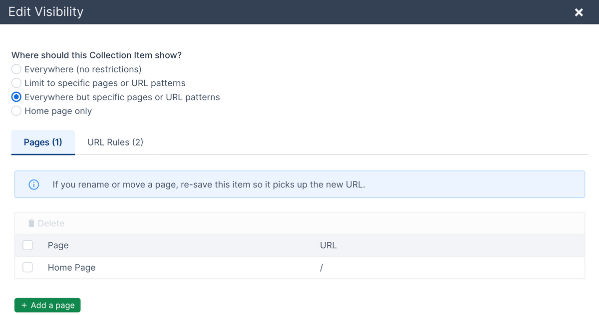
If your website is displaying a collection widget on all pages, you can now limit which pages it will show on without having to change your templates.
A practical example is if you're using a collection widget to show a notification banner at the top of all pages. Or, if you're using it to show a popup message. You don't always want those to show on all pages.
In the past you'd have to customize where a collection widget showed in the site templates.
Now, all collection widget items can be individually customized to set where they show. There are a few different options:
- Show it on all pages. This is the default.
- Limit to specific pages and/or URL patterns.
- Show everywhere but specific pages and/or URL patterns.
- Show on the home page only.
You can select specific pages or app pages to show or hide the item on. You can also set URL patterns to apply to a group of pages. The following patterns can be used:
- URL starts with
- URL contains
- URL ends with
- Exact URL
- URL path with wildcards
You can set the visibility for collection items when adding or editing an individual item. You can also bulk apply visibility settings to multiple items at the same time from the table of items.
You can also set a default visibility configuration when you add or edit the collection itself.
View Content Layout usage
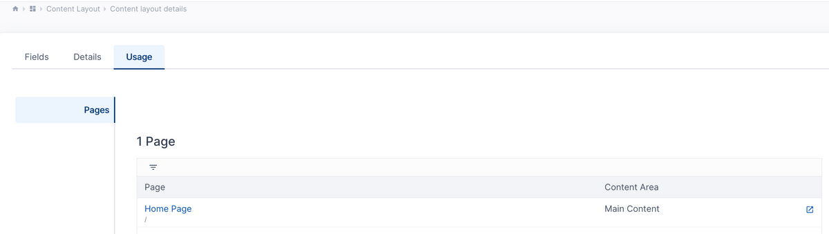
You can now easily see what is using a Content Layout. To do so, click on the Content Layout to go to it's detail page. There is now a "Usage" tab. Clicking it will show if there are any pages, content snippets, or page template configurations that use the Content Layout.